APPENDIX B
HUMAN ENGINEERING
The ATARI Home Computer is first and foremost a consumer computer. The hardware was designed to make this computer easy for consumers to use. Many of the hardware features protect the consumer from inadvertent errors. Software written for this computer should reflect an equal concern for the consumer. The average consumer is unfamiliar with the conventions and traditions of the computer world. Once he understands a program he will use it well most of the time. Occasionally he will be careless and make mistakes. It is the programmer's responsibility to try to protect the consumer from his own mistakes.
The current state of software human engineering in the personal computer industry is dismal. A great many programs are being sold that contain very poor human engineering. The worst offenders are written by amateur programmers, but even software written at some of the largest firms shows occasional lapses in human engineering.
Human engineering is an art, not a science. It demands great technical skill but it also requires insight and feel. As such it is a highly subjective field devoid of absolutes. This appendix is the work of one hand, and so betrays the subjectivities of its author. A proper regard for the wide variety of opinions on the subject would have inflated this appendix beyond all reasonable limits of length. Furthermore, a complete presentation of all points of view would only confuse the reader with its many assertions, qualifications, counterpoints, and contradictions. I therefore chose the simpler task of presenting only my own point of view, giving weak lip service to the most serious objections. The result is contradictory enough to satisfy even the most academic of readers.
THE COMPUTER AS SENTIENT BEING
An instructive way of viewing the problem of human engineering is to cast the programmer as sorcerer, conjuring up an intelligent being, a homunculus, within the innards of the computer. This creature lacks physical embodiment, but possesses intellectual traits, specifically, the ability to process and organize information. The user of the program enters into a relationship with this homunculus. The two sentient beings think differently; the human's thought patterns are associative, integrated, and diffuse, while the program's thought processes are direct, analytical, and specific. These differences are complementary and productive because the homunculus can do well what the human cannot. Unfortunately, these differences also create a communications barrier between the human and the homunculus. They have so much to say to each other because they are so different, but because they are different they cannot communicate well. The central problem in good programming must therefore be to provide for better communications between the user and the homunculus. Sad to say, many programmers expend the greater part of their efforts on expanding and improving the processing power of their programs. This only produces a more intelligent being with no eyes to see and no mouth to speak.
The current crop of personal computers have attained throughputs which make them capable of sustaining programs intelligent enough to meet many of the average consumer's needs. The primary limiting factor is no longer clock speed or resident memory; the primary limiting factor is the thin pipeline connecting our now-intelligent homunculus with his human user. Each can process information rapidly and efficiently; only the narrow pipeline between them slows down the interaction.
COMMUNICATION BETWEEN HUMAN AND MACHINE
How can we widen the pipeline between the two thinkers? We must focus on the language with which they communicate. Like any language, a man-machine language is restricted by the physical means of expression available to the speakers. Because the computer and the human are physically different, their modes of expression are physically different. This forces us to create a language which is not bidirectional (as human languages are). Instead, a man-machine language will have two channels, an input channel and an output channel. Just as we study human language by first studying the sounds that the human vocal tract can generate, we begin by examining the physical components of the man-machine interface.
OUTPUT (FROM COMPUTER TO HUMAN)
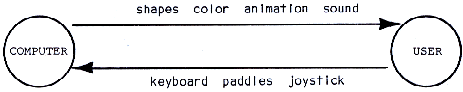
There are two primary output channels from the computer to the user. The first is the television screen; the second is the television speaker. Fortunately, these are flexible devices which permit a broad range of expression. The main body of this book describes the features available from the computer's point of view. For the purposes of this appendix, it is more useful to discuss these devices in terms of the human point of view. Of the two devices (screen and speaker) the display screen is easily the more expressive and powerful device. The human eye is a more finely developed information gathering device than the human ear. In electrical engineering terms, it has more bandwidth than the ear. The eye can process three major forms of visual information: shapes, color, and animation.
Shapes
Shapes are an ideal means for presenting information to the human. The human retina is especially adept at recognizing shapes. The most direct use of shapes is for direct depiction of objects. If you want the program to tell the user about something, draw a picture of it. A picture is direct, obvious, and immediate.
The second use of shapes is for symbols. Some concepts in the human lexicon defy direct depiction. Concepts like love, infinity, and direction cannot be shown with pictures. They must instead be conveyed with symbols, such as a heart, a horizontal figure 8, or an arrow. These are a few of the many symbols that we all recognize and use. Sometimes you can create an ad hoc symbol for limited use in your program. Most people can pick up such an ad hoc symbol quite readily. Symbols are a compact way to express an idea but they should not be used in place of pictures unless compactness is essential. A symbol is an indirect expression; a picture is a direct expression. The picture conveys the idea more forcefully.
The third and most common use of shapes is for text. A letter is a symbol; we put letters together to form words. The language we thereby produce is extremely rich in its expressive power. Truly is it said, "If you can't say it, you don't know it." This expressive power is gained at a price: extreme indirection. The word that expresses an idea has no sensory or emotional connection with the idea. The human is forced to carry out extensive mental gymnastics to decipher the word. Of course, we do it so often that we have become quite fluent at translating strings of letters into ideas. We do not notice the effort. The important point is that the indirection detracts from the immediacy and forcefulness of the communication.
There is a school of thought that maintains that text is superior to graphics for communications purposes. The gist of the argument is that text encourages freer use of the reader's rich imagination. The argument does not satisfy me, for if the reader must use his imagination, he is supplying information that is not inherent in the communication itself. An equal exercise of imagination with graphics would provide even greater results. A more compelling argument for text is that its indirection allows it to pack a considerable amount of information into a small space. The space constraints on any real communication make text's greater compactness valuable. Nevertheless, this does not make text superior to graphics; it makes text more economical. Graphics requires more space, time, memory, or money, but it also communicates better than text. To some extent, the choice between graphics and text is a matter of taste, and the taste of the buying public is beyond question. Compare the popularity of television with that of radio, or movies with books. Graphics beats text easily.
Color
Color is another vehicle for conveying information. It is less powerful than shape, and so normally plays a secondary role to shape in visual presentations. Its most frequent use is to differentiate between otherwise indistinguishable shapes. It also plays an important role in providing cues to the user. Good color can salvage an otherwise ambiguous shape. For example, a tree represented as a character must fit inside an 8x8 pixel grid. The grid is too small to draw a recognizable tree; however, by coloring the tree green, the image becomes much easier to recognize. Color is also useful for attracting attention or signalling important material. Hot colors attract attention. Color also provides aesthetic enhancement. Colored images are more pleasing to look at than black and white images.
Animation
I use the term "animation" here to designate any visual change. Animation includes changing colors, changing shapes, moving foreground objects, or moving the background. Animation's primary value is for showing dynamic processes. Indeed, graphic animation is the only way to successfully present highly active events. The value of animation is most forcefully demonstrated by a game like STAR RAIDERS™. Can you imagine what the game would be like without animation? For that matter, can you imagine what it would be like in pure text? The value of animation extends far beyond games. Animation allows the designer to clearly show dynamic, changing events. Animation is one of the major advantages that computers have over paper as an information technology. Finally, animation is very powerful in sensory terms. The human eye is organized to respond strongly to changes in the visual field. Animation can attract the eye's attention and increase the user's involvement in the program.
Sound
Graphics images must be looked at to have effect. Sound can reach the user even when the user is not paying direct attention to the sound. Sound therefore has great value as an annunciator or warning cue. A wide variety of beeps, tones, and grunts can be used to signal feedback to the user. Correct actions can be answered with a pleasant bell tone. Incorrect actions can be answered with a raspberry. Warning conditions can be noted with a honk.
Sound has a second use: providing realistic sound effects. Quality sound effects can greatly add to the impact of a program because the sound provides a second channel of information flow that is effective even when the user is visually occupied.
Sound is ill-suited for conveying straight factual information; most people do not have the aural acuity to distinguish fine tone differences. Sound is much more effective for conveying emotional states or responses. Most people have a large array of associations of sounds with emotional states. A descending sequence of notes implies deteriorating circumstances. An explosion sound denotes destruction. A fanfare announces an important arrival. Certain note sequences from widely recognized popular songs are immediately associated with particular feelings. For example, in ENERGY CZAR™, a funeral dirge tells the user that his energy mismanagement had ruined America's energy situation, and a fragment of "Happy Days Are Here Again" indicates success.
INPUT DEVICES (FROM HUMAN TO COMPUTER)
There are three input devices most commonly used with the ATARI Home Computer. These are the keyboard, joystick, and paddles.
Keyboard
The keyboard is easily the most powerful input device available to the designer. It has over 50 direct keystrokes immediately available. Use of the CONTROL and SHIFT keys more than doubles the number of distinguishable entries the user can make. The CAPS/LOWR and ATARI keys extend the expressive range of the keyboard even further. Thus, with a single keystroke the user can-designate one of 125 commands. A pair of keystrokes can address more than 15,000 selections. Obviously, this device is very expressive; it can easily handle the communications needs of any program. For this reason the keyboard is the input device of choice among programmers.
While the strengths of the keyboard are undeniable, its weaknesses are seldom recognized. Its first weakness is that not many people know how to use it well. Programmers use keyboards heavily in their daily work; consequently, they are fast typists. The average consumer is not so comfortable with a keyboard. He can easily press the wrong key. The very existence of all those keys and the knowledge that one must press the correct key is itself intimidating to most people.
A second weakness of the keyboard is its indirection. It is very hard to attach direct meaning to a keyboard. A keyboard has no obvious emotional or sensory significance. The new user has great difficulty linking to it. All work with the keyboard is symbolic, using buttons which are marked with symbols which are assigned meaning by the circumstances. The indirection of it all can be most confusing to the beginner. Keyboards also suffer from their natural association with text displays; I have already discussed the weaknesses of text as a medium for information transfer.
Another property of the keyboard that the designer must keep in mind is its digital nature. The keyboard is digital both in selection and in time. This provides some protection against errors. Because keystroke reading over time is not continuous but digital, the keyboard is not well-suited to real-time applications. Since humans are real-time creatures, this is a weakness. The designer must realize that use of the keyboard will nudge him away from real-time interaction with his target user.
Paddles
Paddles are the only truly analog input devices readily available for the system. As such they suffer from the standard problem all analog input devices share: the requirement that the user make precise settings to get a result. Their angular resolution is poor, and thermal effects produce some jitter in even an untouched paddle's output.
Their primary value is twofold. First, they are well-suited for choosing values of a one-dimensional variable. People can immediately pick up the idea that the paddle sweeps through all values, and pressing the trigger makes the selection known. Second, the user can sweep from one end of the spectrum to the other with a twist of the dial. This makes the entire spectrum of values immediately accessible to the user.
An important factor in the use of paddles is the creation of a closed input/output loop. In most input processes, it is desirable to echo inputs to the screen so that the user can verify the input he has entered. This echoing process creates a closed input/output loop. Information travels from the user to the input device to the computer to the screen to the user. Because the paddle has no absolute positions, echoing is essential.
Any set of inputs that can be meaningfully placed along a linear sequence can be addressed with a paddle. For example, menus can be addressed with a paddle. The sequence is from the top of the menu to the bottom. it is quite possible (but entirely unreasonable) to substitute a paddle for a keyboard. The paddle sweeps through the letters of the alphabet, with the current letter being addressed shown on the screen. Pressing the paddle trigger selects the letter. While the scheme would not produce any typing speed records, it is useful for children and the idea could be applied to other problems.
Joysticks
Joysticks are the simplest input devices available for the computer. They are very sturdy and so can be used in harsh environments. They contain only five switches. For this reason their expressive power is frequently underestimated. However, joysticks are surprisingly useful input devices. When used with a cursor, a joystick can address any point on the screen, making a selection with the red button. With proper screen layout, the joystick can thus provide a wide variety of control functions. I have used a joystick to control a nuclear reactor (SCRAM™) and run a wargame (EASTERN FRONT 1941).
The key to the proper use of the joystick is the realization that the critical variable is not the selection of a switch, but the duration of time for which the switch is pressed. By controlling how long the switch is pressed, the user determines how far the cursor moves. This normally requires a constant velocity cursor. A constant velocity cursor introduces a difficult trade-off. If the cursor moves too fast, the user will have difficulty positioning it on the item of choice. If the cursor moves too slowly, the user will become impatient waiting for it to traverse long screen distances. One solution to this problem is the accelerating cursor. If the cursor starts moving slowly and accelerates, the user can have both fine positioning and high speed.
The real value of the joystick is its high tactility. The joystick involves the user in his inputs in a direct and sensory way. The tactility of the keyboard is not emotionally significant. A joystick makes sense—push up to go up, down to go down. If the cursor reflects this on the screen, the entire input process makes much more sense to the user.
Joysticks have their limitations. Although it is possible to press the joystick in a diagonal direction and get a correct reading of the direction, the directions are not distinct enough to allow diagonal entries as separate commands. Just as some words (e.g., "library," "February") are hard to enunciate clearly, so too are diagonal orders hard to enter distinctly. Thus, diagonal values should be avoided unless they are used in the pure geometrical sense: up on the joystick means up, right means right, and diagonally means diagonally.
SUMMARY OF COMMUNICATIONS ELEMENTS
We have discussed a number of features and devices which, taken together, constitute the elements of a language for interaction between the computer and the user. They are:
CONSTRUCTING A LANGUAGE
How do we assemble all of these elements into an effective language? To do so, we must first determine the major traits we expect of a good language:
- Completeness
- Directness
- Closure
Completeness
The language must completely express all of the ideas that need to be communicated between the computer and the user. It need not express ideas internal to either thinker's thought processes. For example, the language used in STAR RAIDERS™ must express all concepts related to the control of the vessel and the combat situation. It need not express the player's anxiety or the flight path intentions of the Zylons. These concepts, while very germane to the entire game function, need not be communicated between user and computer.
Completeness is an obvious function of any language, one that all programmers recognize intuitively. Problems with completeness most often arise when the programmer must add functions to the program, functions which cannot be supported by the language the programmer has created. This can be quite exasperating, for in many cases the additional functions are easily implemented in the program itself. The limiting factor is always the difficulty of adding new expressions to the I/O language.
Directness
Any new language is hard to learn. No user has time to waste in learning an unnecessarily florid language. The language a programmer creates for a program must be direct and to the point. It must rely as much as possible on communications conventions that the user already knows. It must be emotionally direct and obvious. For example, a CONTROL-X keystroke is obscure. What does it mean? Perhaps it means that something should be destroyed; X implies elimination or negation. Perhaps it implies that something should be examined, expunged, exhumed, or something similar. if none of these possibilities are indeed the case, then the command is unacceptably indirect. Keyboards are notorious for creating this kind of problem.
Closure
Closure is the aspect of communications design that causes the greatest problems. The concept is best explained with an analogy. The user is at point A and wishes to use the program to get to point B. A poorly human-engineered program is like a tightrope stretched between points A and B. The user who knows exactly what to do and performs perfectly will succeed. More likely, he or she will slip and fall. Some programs try to help by providing a manual or internal warnings that tell the user what to do and what not to do. These are analogous to signs along the tightrope advising "BE CAREFUL" and "DON'T FALL." I have seen several programs that place signs underneath the tightrope, so that the user can at least see why he failed as he plummets. A somewhat better class of programs provide masks against illegal entries. These are equivalent to guardrails alongside the tightrope. These are much nicer, but they must be very well constructed to ensure that the user does not thwart them. Some programs have nasty messages that bark at the errant user, warning against making certain entries. These are analogous to scowling monitors in the school halls, and are useful only for making an adult feel like a child. The ideal program is like a tunnel bored through solid rock. There is but one path, the path leading to success. The user has no options but to succeed.
The essence of closure is the narrowing of options, the elimination of possibilities, the placement of rock solid walls around the user. Good design is not an accumulative process of piling lots of features onto a basic architecture; good design requires the programmer to strip away minor features, petty options, and general trivia.
This thesis clashes with the values of many programmers. Programmers crave complete freedom to exercise power over the computer. Their most common complaint against a program is that it somehow restricts their options. Thus, deliberate advocacy of closure is met with shocked incredulity. Why would anyone be so foolish as to restrict the power of this wonderful tool?
The answer lies in the difference between the consumer and the programmer. The programmer devotes his life to the computer; the consumer is a casual acquaintance at best. The programmer uses the computer so heavily that it is cost-effective to take the time to learn to use a more powerful tool. The consumer does not have the time to lavish on the machine. He wants to get to point B as quickly as possible. He does not care for the fine points that occupy a programmer's life. Bells and whistles cherished by programmers are only trivia to him. You as a programmer may not share the consumer's values, but if you want to maintain your livelihood you had better cater to them.
Closure is obtained by creating inputs and outputs that do not admit illegal values. This is extremely difficult to do with a keyboard, for a keyboard always allows more entries than any real program would need. This is an excellent argument against the use of the keyboard. A joystick is much better, because you can do so little with it. Because it can do so little, it is easier to conceptually exclude bad inputs. The ideal is achieved when all necessary options are expressible with the joystick, and no further options will fit. In this case the user cannot make a bad entry because it doesn't exist. More important, like Newspeak in Orwell's "1984", the user cannot even conceive bad thoughts because no words (inputs) for them even exist.
Closure is much more than masking out bad inputs. Masking makes bad inputs conceivable and expressible, but not functional. For example, a keyboard might be used with the "M" key disabled because it is meaningless. The user can still see the key, he can imagine pressing it, and he can wonder what would happen if he did press it—all wasted effort. The user can waste even more time by pressing it and wondering why nothing happened. The waste is compounded by the programmer imagining the user doing all these wasteful things and putting in code to stop the symptoms without eliminating the disease. By contrast, a properly closed input structure uses an input device which can express only the entries necessary to run the program, and nothing more. The user can't waste time messing with something that isn't there.
The advantages that accrue when closure is properly applied are manifold. Code is tighter and runs faster because there need be no input error checking; such errors are obsolete in the new program. The user requires less time to learn the program and has fewer problems with it.
The primary problem with closure is the design effort that must be expended to achieve good closure. The entire relationship between the user and the program must be carefully analysed to determine the minimum vocabulary necessary for the two to communicate. Numerous schemes of communication must be examined and discarded before the true minimum scheme is found. In the process, many bells and whistles that the programmer wanted to add will have to be eliminated. If the programmer objectively looks beyond his own values, he will often conclude that the bells and whistles are more clutter than chrome.
CONCLUSIONS
The design of the language of communication between the user and the program will be the most difficult part of the design process in consumer software. The designer must carefully weigh the capabilities of the machine and the needs of the user. He must precisely define the information that must flow between the two sentient beings. He must then design his language to maximize the clarity (not the quantity) of information flowing to the user while minimizing the effort the user must expend to communicate with the computer. His language must utilize the machine's features and devices effectively while maintaining its own completeness, directness, and closure.
SOME COMMON PROBLEMS IN HUMAN ENGINEERING
Having discussed the problems of human engineering in theoretical terms, we now turn to discuss specific application problems in human engineering. The list of problems is not exhaustive; it merely covers some of the problems common to almost all programs.
DELAY TIMES
Many programs require extensive computations. Indeed, almost all programs execute at some time computations that take more than a few seconds to perform. What does the user experience while these computations are executed? Too many programs simply stop the dialogue with the user for the duration of the computation. The user is left with an inactive screen and no sign of life from the computer. The computer does not respond to the user's inputs. If human engineering is created by the language of communication between the computer and the user, then this complete absence of communication can only be regarded as a total lack of human engineering. Leaving the user in the lurch like this is absolutely unforgivable.
Separate Processes
The best way to deal with the problem of reconciling computations with attentiveness is to separate the input process from the computational process. The user should be able to make inputs while the computations are proceeding. This is technically achievable; by using vertical blank interrupts the programmer can multitask input processing with mainline processing. The technique is used in EASTERN FRONT 1941. The real problem with the technique is that many problems are intrinsically sequential in nature. It is essential that the user input a value or choice before the computation can proceed to the next step. This makes it difficult to separate input processing from the mainline processing. However it is possible with clever design to perform anticipatory calculations that will determine intermediate values so that as soon as the critical data is entered, the result might be more quickly obtained. Application of such techniques can surely reduce the delay times that the user experiences.
Speed up the Program
Another means of dealing with this problem is to speed up the program itself. Critical code can often be rewritten to decrease execution time. Proper nesting of loops (the loop with more iterations should be inside the loop with fewer iterations) can reduce execution time. Careful attention to the details of execution can yield further time reductions. Major gains can be made by converting BASIC to assembly language. Assembly is from 10 to 1000 times faster than BASIC. Assembly's advantage is greatest for memory move routines and graphics and least for floating point calculations. By masking out vertical blank interrupts, more 6502 execution time can be freed for mainline processing. Other gains can be accomplished by reducing the DMA overhead ANTIC imposes. This can be done by going to a simple graphics mode (BASIC mode 3 is best). Shortening the display list is another way to reduce DMA costs. Turning off ANTIC altogether is a drastic route which only creates the additional problem of presenting the user with a blank screen.
Entertain the User
The third way to deal with delay times is to occupy the user during the computation. A countdown is one such method. The user sees a countdown on the screen. When the countdown reaches zero, the program is back in business. Another way is to draw random graphics on the screen. The delay period should always start with a courteous message advising the user of the delay. It should also be terminated with a bell or other annunciator. You should not expect the user to keep his eyes on the screen for an arbitrary period of time. Entertaining the user during delays is a poor way to deal with delays that shouldn't have been there in the first place, but it's better than abandoning the user.
DEALING WITH BAD USER INPUTS
The most serious problem with present consumer software is the inadequate way that bad user inputs are handled. Good designs preclude this problem by providing input languages that do not make any bad entries available. As I pointed out earlier, this is most easily accomplished with a joystick. However, there are applications (primarily text-intensive ones) that require a keyboard. Furthermore, even joysticks occasionally introduce problems with user input. How are such bad inputs to be dealt with when they cannot be expunged? Several suggestions follow. It is imperative that any protection system be applied uniformly throughout the entire program. Once the user encounters protection, he will expect it in all cases. The lack of such protection creates a gap through which the user, thinking himself secure, will surely plunge.
Flag the Error and Suggest Solution
The most desirable approach in this unpleasant situation is to flag the user's error on the screen in plain language and suggest a correct entry. Three things must be included in the computer's response. First, the user's entry must be echoed back so he knows what he did that caused the problem. Second, the offending component of the entry must be clearly marked and explained so that the user knows why it is wrong. Third, an alternate legal entry must be suggested so that the user does not become frustrated by the feeling that he has encountered a brick wall. For example, an appropriate response to a bad keystroke entry might read thusly: "You pressed CONTROL-A, which is an autopsy request. I cannot perform autopsies on living people. I suggest you kill the subject first."
This method is obviously very expensive in terms of program size and programming time. That is the price one pays for bad design. There are less expensive and less effective methods.
Masking out Bad Keys
One common solution to keyboard input problems is to mask out all bad entries. If the user presses a bad key, nothing happens. No keyboard click is generated and no character appears on the screen. The program only hears what it wants to hear. This solution is secure in that it prevents program crashes, but it does not protect the user from confusion. The user would only press a key if he felt that it would do something for him. Masking out the key cannot correct the user's mistaken impression. It can only lead him to the conclusion that something is seriously wrong with his computer. We don't want to do this to our users.
A variant on this scheme is to add a nasty buzzer or raspberry to chastise the user for his foolishness. Indeed, some amateurish programs go so far as to heap textual abuse on the user. Such techniques are highly questionable. There may indeed be cases requiring dangerous keystroke entries which are guarded by fierce and nasty messages; such cases are quite rare. Corrective messages should always conform to high standards of civility.
Error Messages
An even cheaper solution is to simply post an error message on the screen. The user is told only that he did something wrong. In many cases, the error message is cryptic and does not help the user in the least. ATARI BASIC is an extreme example of this. Error messages are provided by number only. This can be justified only when the program must operate under very tight memory constraints.
In most cases, the designer chooses to sacrifice human engineering features such as meaningful error messages for some additional technical power. As pointed out in the beginning of this appendix, we are reaching the stage in which additional technical power is no longer a limiting factor to consumers, but human engineering is a limiting factor. Thus, the trade-off is less justifiable.
Protection/Power Trade-Offs
One objection to many human engineering features is that they slow down the user's interaction with the computer. Programmers tire of incessant "ARE YOU SURE?" requests and similar restrictions. One solution to this problem is to provide variable protection/power ratios. For example, a program can default to a highly protected state on initialization. All entries are carefully checked and echoed to the user for confirmation. The user has an option to shed protection and work in high-speed mode. This option is not obvious from the screen—it is only described in the documentation. Thus, the intensive user can work at a fast pace and the casual user can have adequate protection.
MENUS AND SELECTION TECHNIQUES
Menus are standard devices for making the user aware of the options available. They are especially useful for beginning users. Command-oriented schemes preferred by programmers confuse beginners who cannot afford the time investment to learn the lexicon of commands used by a command-oriented program. We will discuss several common problems associated with the use of menus.
Menu Size
How many entries should be on a menu? The obvious upper limit is dictated by the size of the screen, but this limit is too large, for a BASIC mode 0 screen could hold up to 48 entries (24 lines with two choices per line). My guess is that seven entries is the desired upper limit on menu size. This allows plenty of screen space to separate the entries, provide a menu title, and some sort of prompt.
Multiple Menus
Frequently a program will require several menus to fully cover all of the options it offers. It is very important that multiple menus be organized in a clear manner. The user can easily get lost wandering around through such menu mazes. One way is to have a main menu that is prominently marked as such, and provide each secondary menu with an option to return to the main menu. Another way is to nest menus in a hierarchical structure. When using such methods, the programmer must provide color and sound cues to help the user ascertain his position in the menu structure. Each menu or menu level should have a distinctive note or color assigned to it. The note frequency should be associated with the position in the hierarchy.
Selection Methods
Once the user has seen his options, how does he make his choice known to the computer? The most common way is to label each entry on the menu with a letter or number; the user makes his selection by pressing the corresponding key on the keyboard. This is a clumsy solution involving unnecessary indirection. There are a number of better methods. Most of them use the same basic scheme: a movable pointer addresses an option, and a trigger selects it. One scheme highlights the option being addressed in inverse video. The SELECT button changes the pointer to address the next menu selection, with full wraparound from the end of the menu to the beginning. The START button engages a menu option. Another program automatically rotated the pointer through the menu options; the user need only push a button at the correct moment when his desired option was being addressed (not an impressive method). Paddles and joysticks are very well suited for menu selection. Either one can be used to sweep the pointer through the menu selections, with the red trigger button making the selection. My pet scheme for menu selection uses a cursor on a large scrolling menu. The user moves the cursor with a joystick. Signposts can direct her to different regions of the menu. The user makes a selection by placing the cursor directly on top of an option and pressing the trigger button.
MANUALS VERSUS ON-BOARD TEXT
A common problem with menus, error messages, prompts, and other messages is that such material can easily consume a large amount of memory—memory that could well be used for other features. Such material could be placed in a reference document, but doing so would detract from the quality of the program's human engineering. The designer must decide how much material should go into the program and how much should be relegated to the manual. With disk-based programs it is possible to store some of the material on the diskette; this lessens the harshness of the trade-off. When the problem is approached only from the human engineering point of view, it is easily answered: all material should be included in the program, or at least on a diskette. Economic and technical considerations argue against this. It is my personal view that each technology should be used for the things it does best. While the computer can handle static text, its forte is dynamic information processing. Paper and ink handle static information more cheaply and often more clearly than a computer. I therefore prefer to put static information into a manual and let the program refer the user to the manual. I still include critical information within the program; my dividing line bends with local needs.
MEASURES OF SUCCESS
How can a designer determine the success of his human engineering? There are several indicators that provide valuable feedback. The first is the minimum length of the manual. If you exclude background material and isolate only the material in the manual that is absolutely necessary to describe how to use the program, then the length of this material is a good measure of your human engineering. The more material, the worse you've done. A well-designed program should require very little explanation. This should not be construed as an argument against proper documentation. Documentation should always describe the program in more detail than is absolutely necessary. A long, lavish manual is good; a program that demands such a manual is not.
Another measure is the amount of time that a first-time user expends to learn to use the program satisfactorily. Good programs can be used in a matter of minutes.
A third measure is the amount of thinking a user must do to use the program. A well-designed program should require no cognitive effort to use. This does not mean that the user does not think at all while using such a program. Rather, he thinks about the content of the program rather than the mechanics of the program. He should concentrate on what he is doing, not how he does it.
The well-engineered program eliminates mental distance between the user and the computer. The two thinking beings achieve a mental syntony, an intellectual communion.
Return to Table of Contents | Previous Chapter | Next Chapter